UX + Content Design with Hatch
Challenge
Rest, the incredibly popular sleep device I didn’t realize all the parents I know use to help their kids fall (and stay) asleep, was wanting to expand into providing more sleep guidance for parents. An additional goal was to drive subscriptions to Hatch’s new premium content service, Hatch+, which provides stories, guided meditations, and more beyond the colorful lights and sleep sounds included with the product.
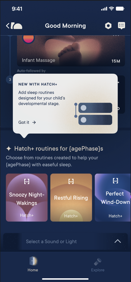
As a start, they developed a set of curated sleep routines for the baby demographic (3-12 months old) using Hatch+ content.
The question was, how to introduce these routines and get parents excited about using them, as well as drive Hatch+ sign-ups?
Process
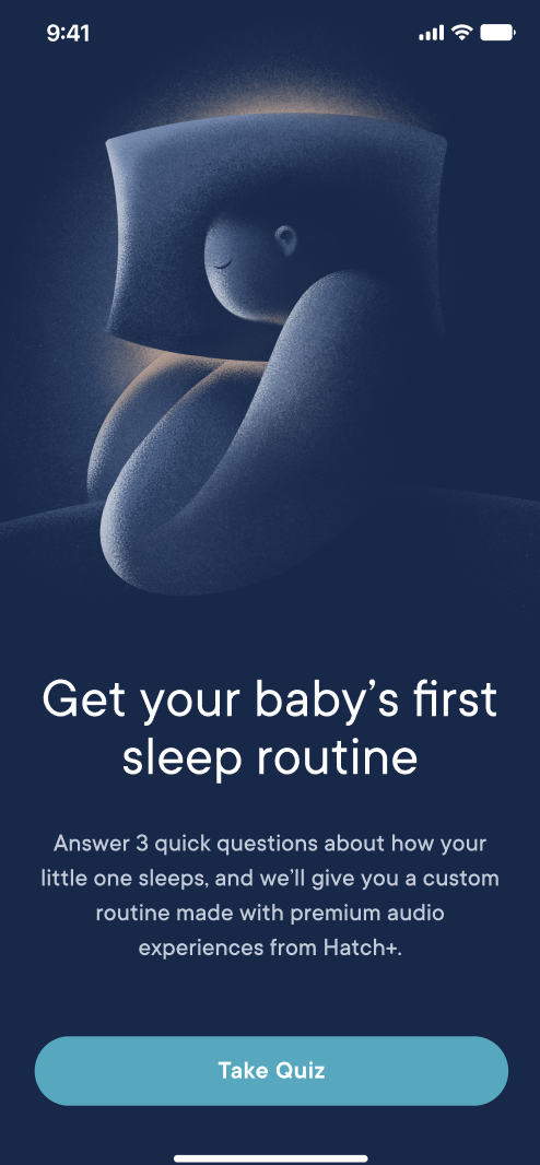
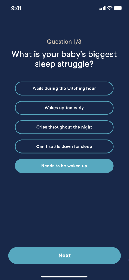
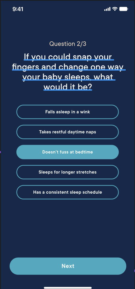
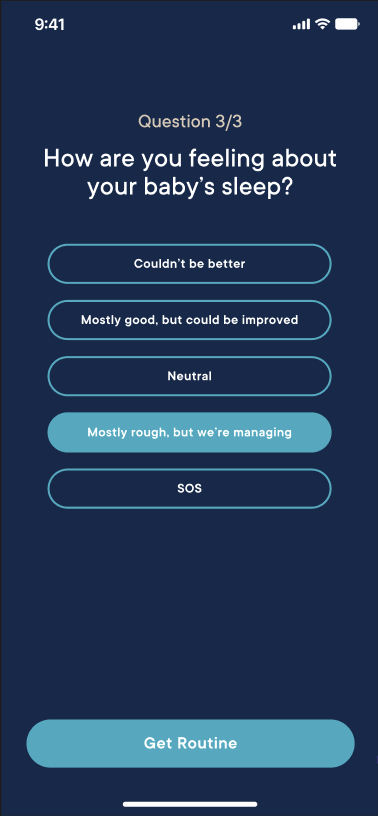
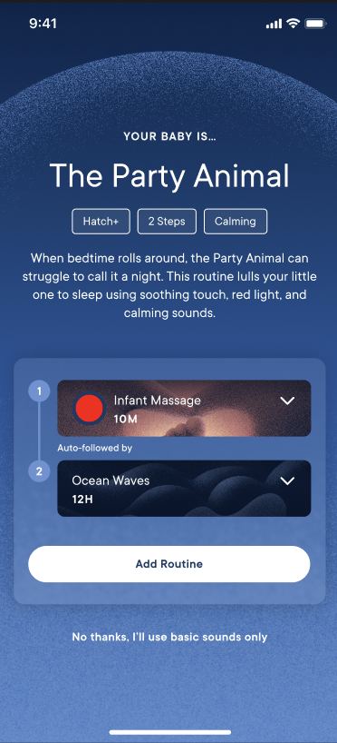
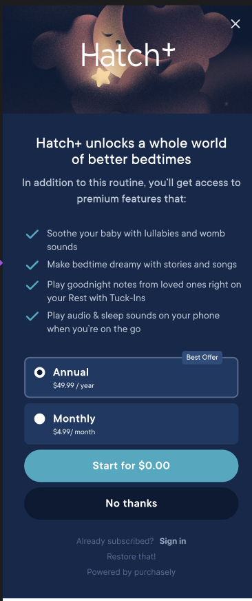
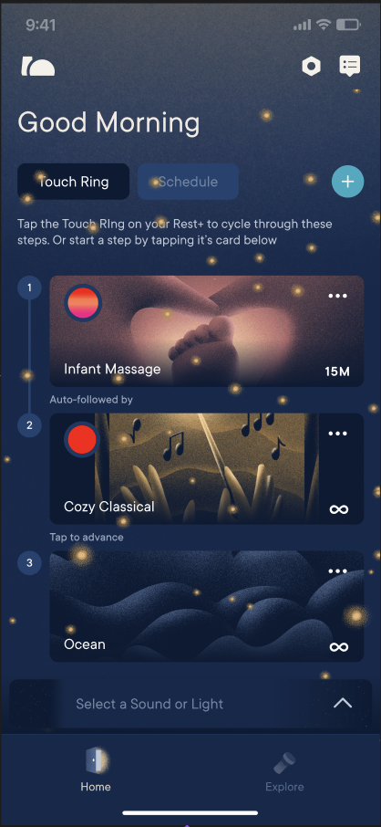
The team decided to try an in-app quiz to get a better idea of what parents’ particular sleep struggles were with their babies, and to provide a playful sleep persona along with suggested routines to meet their needs. I worked closely with UX Researcher Laura Carroll and Lead Product Designer Riley Gish to develop the copy for the quiz, personas, and routines. We leaned on research from child sleep development experts to inform what needs the routines would meet, and quiz questions would point to. We surfaced the routine, then introduced the Hatch+ free trial option before returning the user to the home screen.
Results
As cute as we thought the end result turned out…our UX researchers came back with some bad news.
We learned from interviews done with parents trying out the quiz that, on the whole, they were less interested in what kind of sleep persona we’d assigned their baby, and more interested in getting them to sleep ASAP (go figure).
So, to meet our user’s needs more closely, we ditched the quiz and personas, and instead whipped up a to-the-point solution that got straight to the suggested routines.
